“The rebrand of Central into Chicken Shack was the first of (hopefully) a series of full campus identity refurbishments that eat@Newcastle would like to carry out alongside the AG Education team.
The AG team has worked to very tight deadlines on this, managing to take the project from concept to delivery in a few weeks, just in time for a launch during Freshers’ Week, helping us maximise impact.
The finished product is modern and relevant, reflecting the identity of the café and the direction we want to take it in. Staff in the unit are really excited about the changes, and we have had numerous comments from both staff and students who all love the new vibe!”
Eat@ Central was convenient, but it wasn’t capturing anyone’s attention. The decor felt tired and the feel was corporate, making it blend into the background while a nearby high street coffee chain was drawing in the crowds. Newcastle University needed something that was bold, brilliant, and student-focused which called for a brand redesign to create a space that looked the part, felt like the place to be and most importantly, got students lingering, socialising, and coming back for more. Our challenge was to come up with a concept that combined style, comfort, and functionality while reflecting on the University’s brand identity. From striking visual designs and cohesive colour schemes, we set out to create an inviting atmosphere that left more of a lasting impression and turned a need-must into an on-campus hotspot.
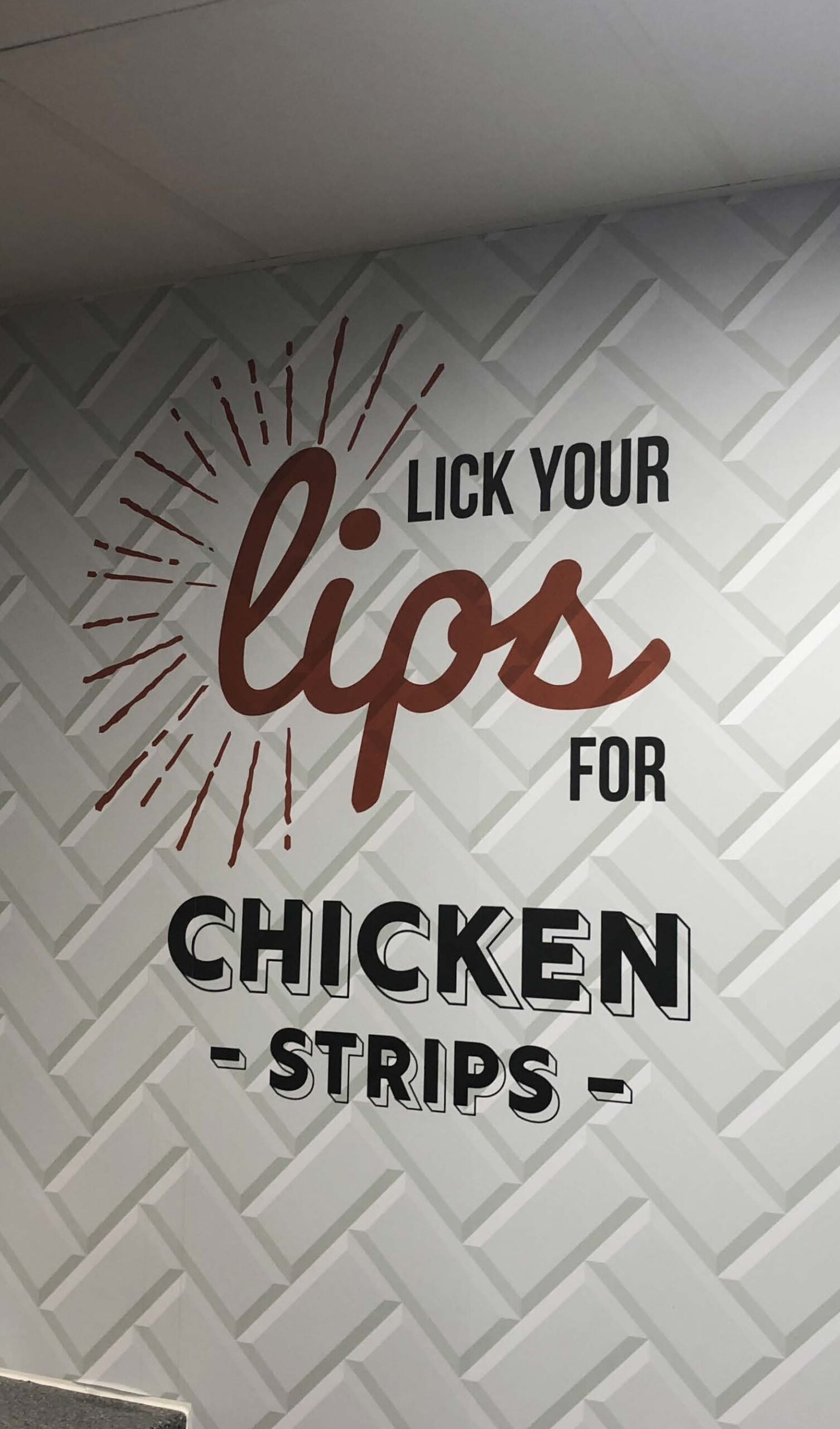
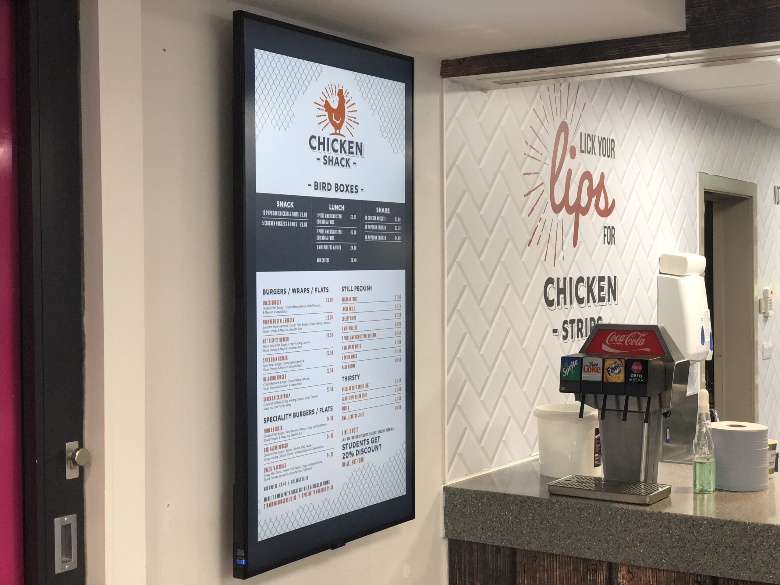
In true AlphaGraphics style we kicked off with a hands-on site visit to soak up the space, get a true feel for how students interacted with it and spot opportunities to bring something fresh to the table. Inspired by the cafe’s predominantly chicken-based menu (and admittedly a few taste tests), a bold idea emerged: The Chicken Shack. Our in-house design team handled the creation of a new logo, colour palette and brand guidelines with a simple brief to be original, be cheeky, and use an aged print aesthetic. From there we developed some visual mock-ups for the space, which were quickly given the green light from the University. Our Graphic Designers quickly got to work transforming the concept into a full cafe redesign including printed wallpaper, vinyl wraps for counters and kitchen areas and window vinyls to complement the overall look and feel. Adding our favourite ingredient, a sprinkle of personality and humour, we introduced ‘Hen-Based Shell-ebrities’ like Lindsey Lo-hen and Cluck Norris to the walls. Our Large Format team printed, cut and installed all graphics, while custom flags all designed and delivered by AlphaGraphics marked the cafes reopening.
Cafe@’s rebrand into The Chicken Shack speaks for itself, their chicken sales are cluckin’ brilliant and we’re incredibly proud to have created a brand for Newcastle University that has bold graphic design, playful branding and a fresh student-focussed feel.

Still looking for the right solution? Our experts can help you bring your brand to life.